(This post contains affiliate links. This means that if you purchase through these links I receive a small commission at no cost to you. For more information see our disclosure policy here)
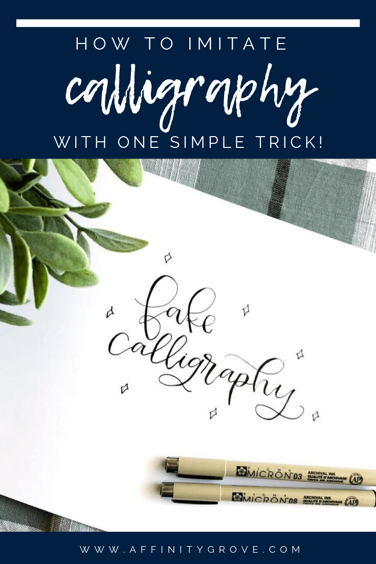
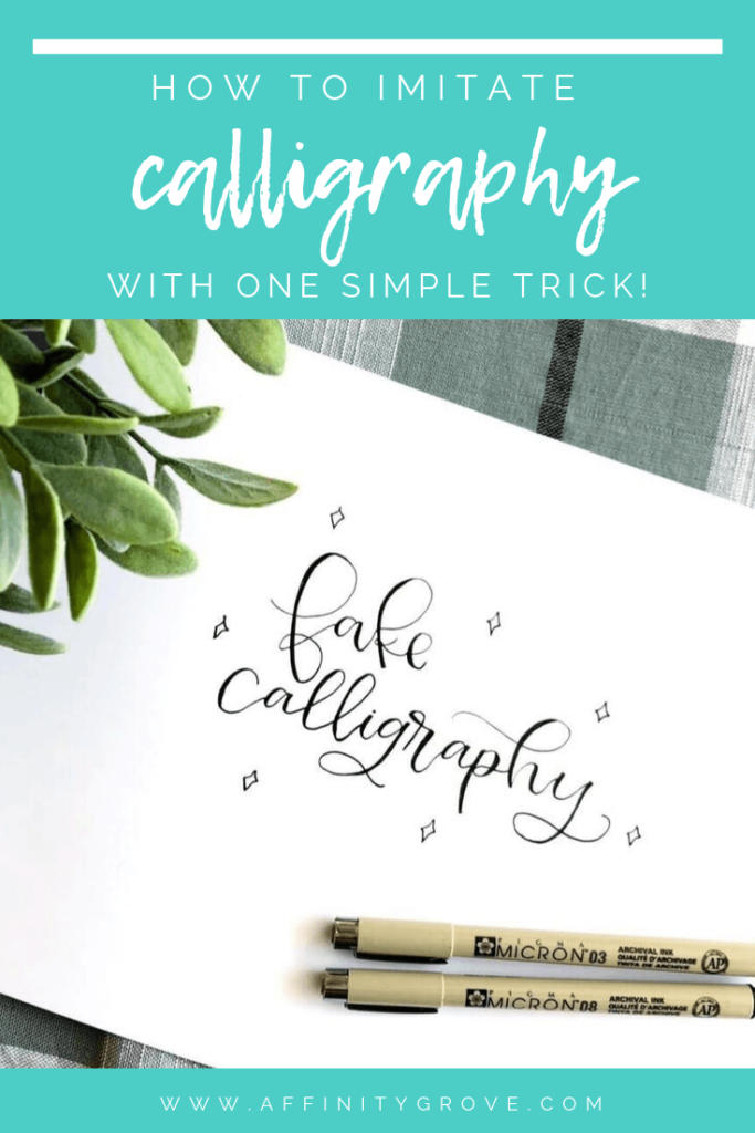
Learning how to do calligraphy can be super intimidating! Especially when you pick up a brush pen and realize how it magnifies your flaws! But with this super simple trick you can easily imitate that beautiful calligraphy, while you’re trying to master it!
Upstrokes and Downstrokes
The dynamics of calligraphy are actually pretty simple. Thick downstrokes, and thin upstrokes! Piece of cake right? Okay, in application learning to do that is actually really difficult! But once you start paying attention to the different calligraphy pieces you love, you will notice that that is a defining element of calligraphy.
Sure you can add swashes and elements to your letters, but those thick downstrokes really define calligraphy!
There is actually a term for fake calligraphy, maybe it’s a real term or just something used by those in the industry. But it is “Fauxligraphy” and that’s exactly what we are going to do fake calligraphy!
So how do you imitate calligraphy? Well it’s simple! Let me show you how!
Use Monoline Pen to Write out Words
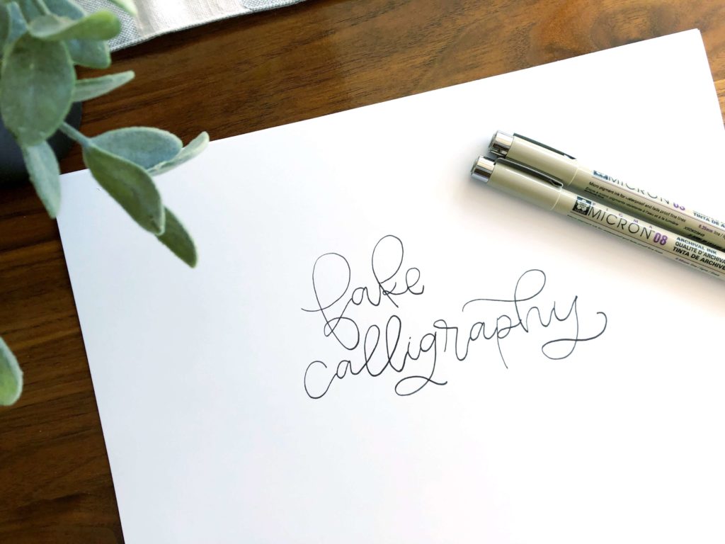
For starters you want to use a monoline marker. Not a fancy brush pen, or nib, but just a simple pen or marker. I really like these Micron ones, because they come in different sizes and are archival ink so your work won’t fade and look crappy a week down the road!
When I do fauxligraphy I like to start out with a thicker pen. Start out by writing your word how you want it to look. If you want to add swashes, or embellish your words go ahead and do that now.
This will be the base of your fake calligraphy, so don’t expect this to change too much, besides those downstrokes.
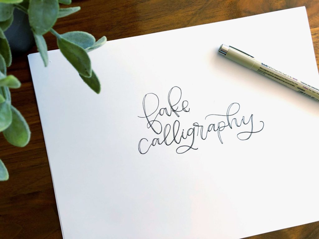
Add a line next to each downstroke
Now you are going to go through and create a line next to any downstroke in your piece. If you want your downstrokes to be super thick make this line further away from the original line. For something that isn’t super thick, go closer to the original line.
You can see in the illustration about how I have created lines next to each downstrokes. And then connected that line to the original line to create a box.
This box will become our thicker downstroke, and give us our calligraphy look!
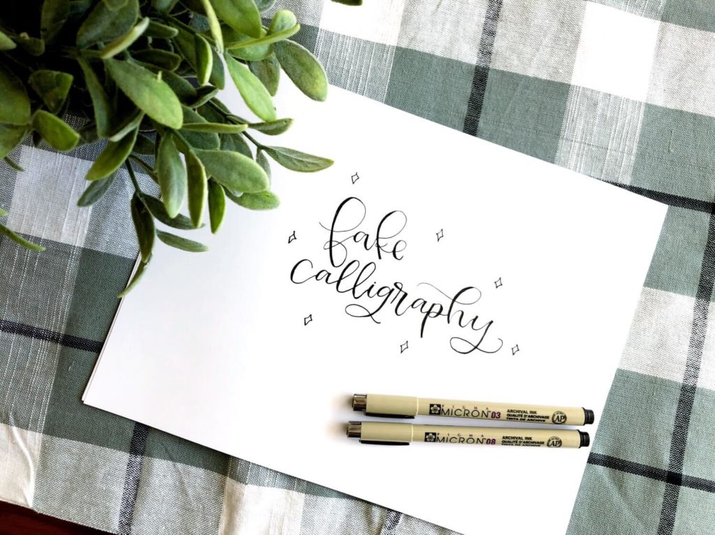
Fill in the box
Next fill in that box with your marker. This is another reason I love the Micron Pens, because it’s lots easier to get into the small spaces with a smaller point pen!
As you fill in each box you will notice each letter looks more and more like calligraphy!
And as you can see, fauxligraphy is super easy!!
And it looks awesome!
I actually use fauxligraphy frequently! Anytime I can’t use a brush pen, I resort to fauxligraphy. For example when I paint wood signs with a paint pen, I use fauxligraphy. Or when I am designing our word cutouts, I use fauxligraphy.
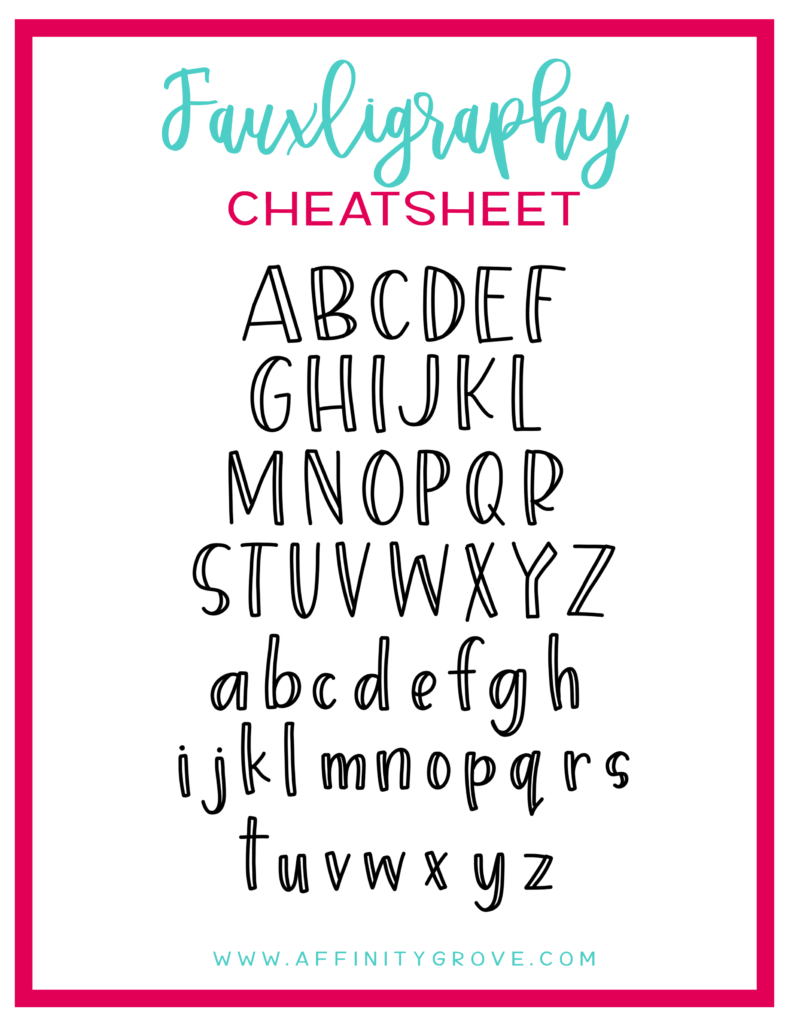
Faux-ligraphy Cheat Sheet
I remember when I first started learning how to do calligraphy, it was super hard to remember where those downstrokes were supposed to be!
So I created this handy cheat sheet that you can print and reference if you find yourself struggling!
Another huge benefit of faux-ligraphy is that it will teach your where you should be doing thick strokes until it becomes habit!
Good luck as you imitate calligraphy!
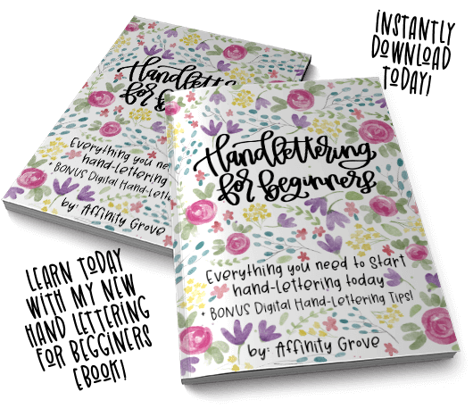
Want to learn how to how to actually letter, no cheating allowed? Check out this post for my beginners guide to hand lettering!
This site uses cookies to enhance your experience on our site! For more information see our Privacy Policy. Click Accept or continue browsing to accept these conditions.


No comment yet, add your voice below!