(This post contains affiliate links. This means that if you purchase through these links I receive a small commission at no cost to you. For more information see our disclosure policy here)
So everyone who hand letters knows that it’s more than just calligraphy. It’s really using the letters to create something unique by making changes, big or small, that compliment the whole design. Once you have figured out how to master the calligraphy side (thick down strokes, thin upstrokes) of making letters, then you can really make your hand lettering look unique.
There are seriously endless amounts of variations that you can use to make your lettering look unique! I’m going to go over a few very simple changes that will make a huge difference in the outcome of your piece!
Bounce Lettering
When you are just doing normal lettering with nothing too fancy, you typically stay within the same parameters for your letter heights. You can see that in the first example of the word bounce above. There isn’t very much variation in the heights of each of the letters.
When you do bounce lettering, you want to bounce your letters! Add variation to the height, how far down you go with your connecting lines to the next letter, and ignore those usually parameters!
Bouncing your letters can have a huge impact on how your piece turns out! It is typically my go-to avenue for how to add variety to my work!
And it’s really fun to bounce letter! You don’t have to worry about all the letters being the same height, or even size for that matter. Because when they aren’t all the same height, you just don’t notice that kind of stuff as much! Give it a go and see the difference it is in making your hand lettering look unique!
Descending Variations
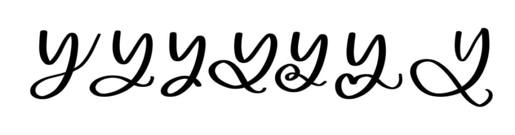
I actually love words more when they have a descender! That may be a totally strange thing to admit. But they are way more fun to write. And to top it off, they can add so much variety to a piece!
In the above illustration you can see the various ways that you can easily change just the descending part of the letter for a completely different feel.
It’s a smart idea to avoid drawing these descending lines until after you have completed the words below it. That way you know how much room you actually have to use.
Or go for it big and create your descending accents early on in your piece and let them define the piece!
Seriously play around with it, and you will love y’s, g’s, j’s and z’s so much more!
Ascenders
Of course if we talked about descenders we are going to talk about ascenders! But don’t worry, I love them almost as much as I love the descenders! These are the letters that I know I can always count on to give my piece that added pizazz.
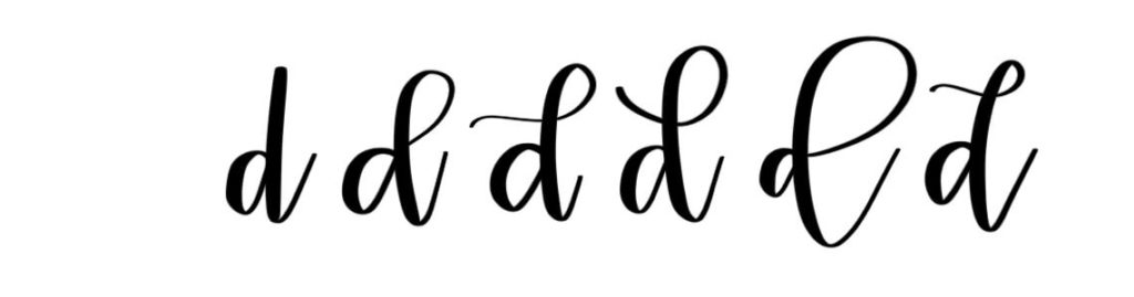
First of all by adding a rounded element to your ascender is a really good starter. Even most new hand-letterers have seen and tried that though.
In the example about the letter d ascenders are changed to make each letter look just a little different.
By changing the shapes of the lines in your ascenders you can create a completely different looking embellishment. Give it a go and see what you can do by changing your ascenders!
Letter Combinations
Okay, it’s getting into the good stuff now! Because one of the best parts of lettering if how you get to make something awesome out of something ordinary. I mean it’s all the same 26 letters and yet through different ways of combining and having them interact with one another you can create something amazing!
Take a look at the letter combinations of th and ch in the example above. The first pairing is a normal lettering combination. Look how you can create something amazing by simple alterations.
Using the h to cross the t makes a beautiful and seamlessly lettering combination that’s visually pleasing. Choosing not to connected the t and the h and the bottom and only from the t cross adds variety in a different way! And finally choosing to cross the t in a different shaped line also changes the look.
There are more examples of how to combine letters in the examples with the ch’s. See how simple little changes creates a different effect? Easily make your hand lettering look unique by carefully combining your letter variations with other letters!
These are super easy things to change that can make a big difference. Play around with your letter combinations, and ways that you can create them to work with one another!
Special Letters
Truthfully there are just some letters that are more fun to write than others! It’s just how it goes! And those letters I typically use to add variety to my design.
You don’t always have to use the same r, or a in one piece! Unless you’re going for a font type piece, changing it up a little makes it more unique!
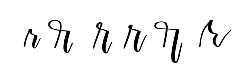
My go-to letters that I always use to mix things up are my r’s, s’s and o’s. There are seriously so many different way that you can write each one of them. And they can totally change the feel of a design!
In the example above you can see how many different ways you can write an r. Each different variations creates a different feel. When you utilize them individually or together you will see the difference and creating your own style of hand lettering!
Those are just the letters I love! Maybe you have other letters that you have learned to variate with. But find some go to letters that you can change up, and various ways to embellish them!
These simple change will seriously take your lettering to the next level! It’s not difficult to add just different shaped part of a letter. But you have to figure out what you like and what works for you.
Once you have played around with how to write different letters enough, you will find what you like best, and what looks best!
So get your pens/markers/pencils/crayons whatever you like to letter with and practice! Stretch your thinking and create some different variations of letters.
It will drastically improve the way your hand lettered designs look!
Happy Lettering!
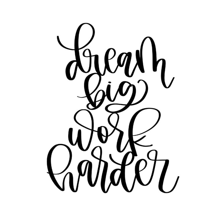
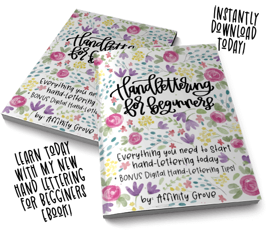
Learn more in Hand-lettering for Beginners Ebook today!
This site uses cookies to enhance your experience on our site! For more information see our Privacy Policy. Click Accept or continue browsing to accept these conditions.


No comment yet, add your voice below!